Linen, Wool or Cotton: Choosing a Curtain Texture
Linen, wool or cotton curtain texture shapes a window’s drape and mood. Compare how each fabric feels, hangs and suits a country room before choosing.
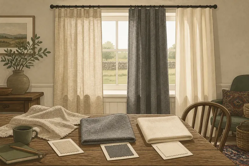
Linen, wool or cotton curtain texture can make the same window feel crisp, soft or quietly substantial. The difficulty is that a fabric sample cannot show how a full curtain will hang, and a handsome cloth can look wrong once it meets the room’s light, furniture and daily use.
When a curtain choice disappoints, the cause is often a mismatch between the fabric’s character and the effect expected from it. A useful way to decide is to name the problem first: too stiff, too limp, too formal, too plain, or simply too much visual activity. Then choose the cloth whose natural behavior addresses it.
Linen looks too casual
Linen’s visible slubs and relaxed surface give it a natural, slightly irregular character. That texture suits painted timber, old plaster, stone and rooms where a perfectly smooth finish would feel overworked. But linen can look untidy if the rest of the window treatment is expected to be crisp and uniform.
The usual cause is asking a relaxed fabric to behave like a formal one. A loose weave, soft finish or unstructured heading may let folds fall unevenly. The remedy is not necessarily a different fiber. A more closely woven linen, a lined construction, or a fuller heading can make the window read as considered without erasing the cloth’s texture.
Look at a large sample against the actual wall and hold it near the window at different times of day. Linen’s irregular surface catches light in a way a small swatch can understate. If the room already has busy grain in floors, baskets and upholstery, a quieter linen weave may settle the view.
For a composed look, keep the surrounding trim simple and let the linen supply the variation.
Wool feels too heavy
Wool has a soft, dense hand and a more substantial visual presence than many cottons or linens. It can make a window feel grounded, especially in a room with dark wood, rough stone or deep-toned walls. The problem arises when that weight overwhelms a small room or makes a modest window seem solemn.
That effect usually comes from the combination of a dense cloth, deep color and generous folds, rather than from wool alone. Try a lighter-weight wool or wool blend, a clearer color, or a less elaborate heading. A brushed surface can retain softness without reading as a heavy panel; a sharply textured, thick weave may do the opposite.
Consider how the curtain will sit when open as well as when drawn. A substantial fabric gathers into a noticeable stack at the sides. If that stack would crowd a narrow window or obscure a view, choose a lighter cloth or make sure the fitting allows the panels to sit clear of the glass.
Choose wool for its tactile depth, not simply because the room feels cold in winter. Fabric alone should not be treated as a substitute for suitable window coverings or building improvements.
Cotton hangs too plainly
Cotton is often chosen for its familiar, straightforward feel, but plain cotton can look flat beside materials with stronger surface character. This is most noticeable in rooms where the walls and furnishings are already smooth and pale. The curtain may be perfectly serviceable yet contribute little to the room’s sense of depth.
The usual cause is a smooth weave paired with an understated color and a simple fold. If the aim is a little more presence, try cotton with a visible weave, a woven stripe, or a subtle slub. A lined cotton can also give the panel a fuller outline. These changes add interest without asking the fabric to imitate linen or wool.
Conversely, a textured cotton may be the right answer when a room already contains patterned rugs, checked cushions or busy wallpaper. It can provide a calmer surface while still feeling less formal than a sleek, tightly woven fabric.
Use cotton when an uncomplicated, easygoing appearance matters more than pronounced texture.
When does curtain texture feel wrong?
Why does linen wrinkle?
Linen tends to crease because its relaxed surface is part of its character. If a crisp appearance matters, consider a more structured weave or a blend, and check the care label before deciding how the fabric should be maintained.
Why do curtains look stiff?
A dense weave, strong lining or overly structured heading can make folds hold their shape instead of falling softly. Look at the cloth hanging as a full-length sample if available, and compare how it moves with the room’s desired mood.
Why do curtains look flat?
A smooth surface, low-contrast color and shallow folds can leave a window without much visual depth. A woven texture or clearer fold can add definition without introducing a strong pattern.
Which fabric suits a relaxed country room?
There is no single country-house fabric: linen often reads as informal, wool as more substantial, and cotton as straightforward. Choose by the room’s existing surfaces and the way you want the curtain to sit, rather than by a style label.
Read the drape first
Texture and drape are related, but they are not interchangeable. Texture describes the visible and tactile surface; drape describes how a panel falls into folds. A cloth can feel soft in the hand yet hang stiffly, while a crisp surface may fall into a supple line.
Imagine you have a north-facing sitting room with pale walls, a worn oak table and a patterned rug. A small, smooth cotton sample looks anonymous beside the rug. A loosely woven linen sample adds enough irregularity to connect with the old timber, but its pale tone disappears against the wall. A mid-tone, more closely woven linen could give the window definition while keeping the relaxed surface. The useful observation is not that linen always wins; it is that a fabric must be judged by both its surface and its outline in that room.
Where possible, pin a large sample beside the window and let it hang vertically. View it with the curtains open and closed, then stand where you usually sit. A swatch held flat cannot show the folds that create much of a curtain’s visual character.
Match fabric to room mood
Start with the mood you want at the window, then use the fabric as one part of that decision:
- Relaxed and irregular: choose linen with a visible weave or slub, especially where natural surfaces already appear in the room.
- Soft and grounded: consider wool or a wool blend when a denser, more tactile presence suits the scale and furnishings.
- Simple and quiet: use cotton with a restrained weave when pattern and texture elsewhere should remain in charge.
- More definition: compare a mid-tone cloth with the wall color, rather than relying on texture alone to create contrast.
- Less visual weight: favor a lighter-looking weave and modest folds if the curtain stack would dominate the window.
Fabric labels, care instructions and maker guidance matter, particularly when a cloth includes a blend or special finish. For a lined or treated curtain, follow the relevant manufacturer instructions rather than assuming that all versions of a fiber behave alike.
The practical answer to linen, wool or cotton curtain texture is the fabric that solves the room’s specific visual problem without creating another. Compare a hanging sample, watch its folds, and decide whether the window needs more irregularity, more substance or more restraint. That small distinction is often clearer than choosing by fiber name alone.